WHERE WE STARTED
A change of location from Queensland to Melbourne was just the right inspiration for this business to start fresh. Rebrand time.
The client had a clear vision on what needed to be done.
This included:
● Pink and white colour palette
● Circle logo (excluding times where a horizontal lock up was essential)
● Simple logo that feels timeless
● Heavy weighted san serif typeface
● Large phone number (for printed marketing material)
● Branding should feel luxurious, fresh, clean, and feminine
● Circle logo (excluding times where a horizontal lock up was essential)
● Simple logo that feels timeless
● Heavy weighted san serif typeface
● Large phone number (for printed marketing material)
● Branding should feel luxurious, fresh, clean, and feminine
Where we wound up
After settling on a clean, spacious logo, it was time to add a little of the luxury shine the client was looking for.
What better way to keep it high end than with a nice diamond pattern for the background. Couple that with pink flowing clouds, and the client’s brief had been met - Luxurious, fresh, clean, and feminine.
Sarah’s website saw an immediate 61% increase in traffic. This helped her book out a full client roster and become the most sought-after beautician in her area. With a reputation as stellar as hers, she is now the premier tanner for the ICN body competitions in Melbourne.

Business Cards


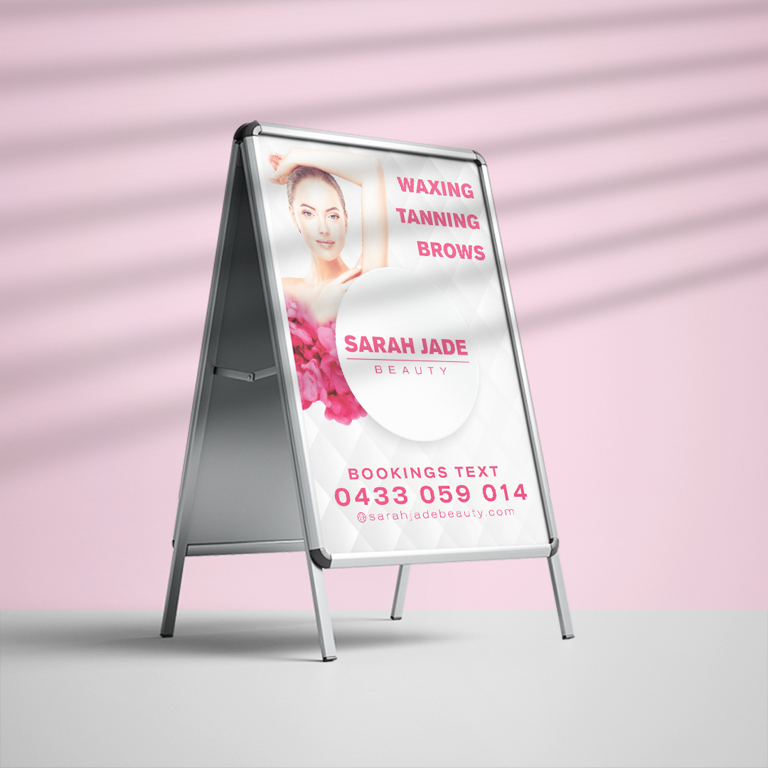
A- Frame Stand
Final deliverables:
● Print marketing collateral
● Image discovery/selection/treatment
● Website art direction (Working with a third party)
● Branded backgrounds for use in social media
● Email signature
● Administration forms
● Image discovery/selection/treatment
● Website art direction (Working with a third party)
● Branded backgrounds for use in social media
● Email signature
● Administration forms