WHERE WE STARTED
Business consultants operating since 2016, Agudo approached me for a slight logo refresh.
Like any designer worth their salt, I had to be honest and let them know if this was the right path or not.
It wasn’t. And so I let them know a slightly more involved rebrand was what they were looking for.
New colours. New logo. New look. It was time to stand out.
WHERE WE WOUND UP
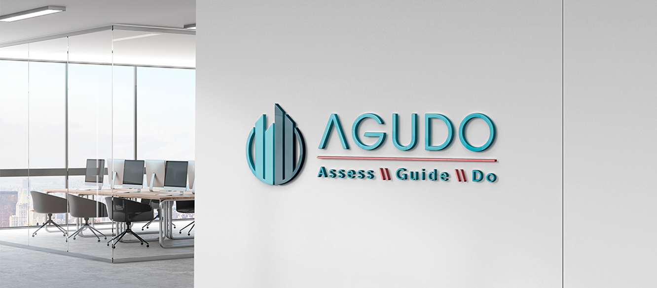
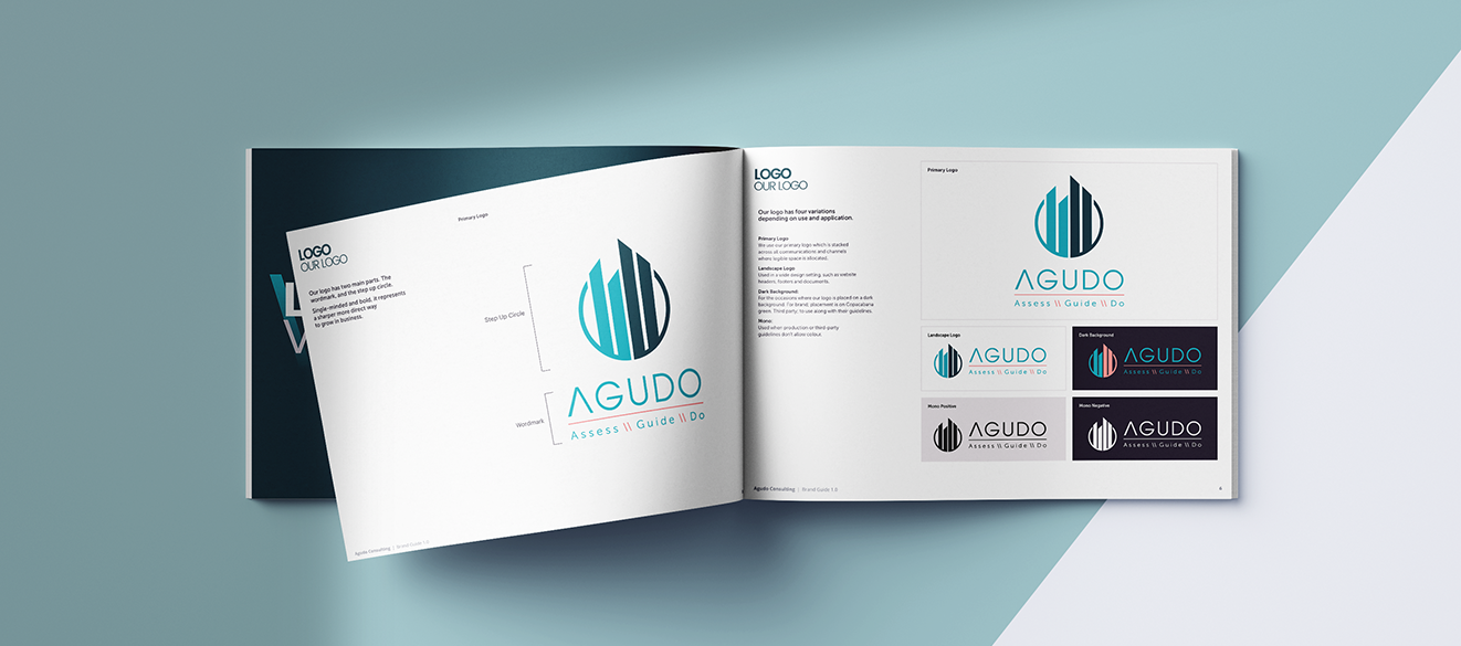
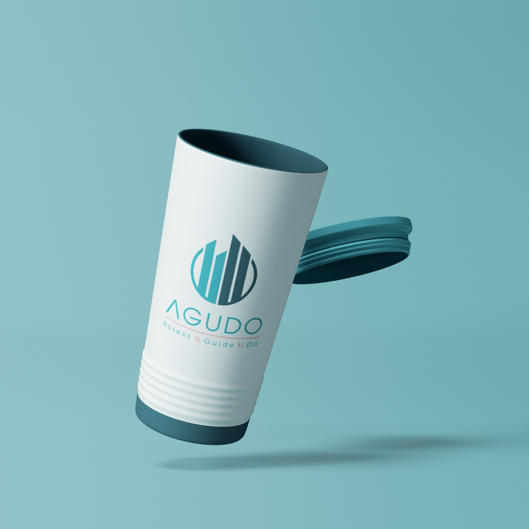
The word Ãgudo stands for ‘point’, ‘acute’, ‘clever’. It represents ambition, independence, strength, reliability, determination and professionalism.
As a business that helps people move forward, sharp, directional shapes were at the centre of my designs. Clients needed to know that Agudo could be the consultants for every business need. So my designs weren’t going to leave any doubt in their customer’s minds.
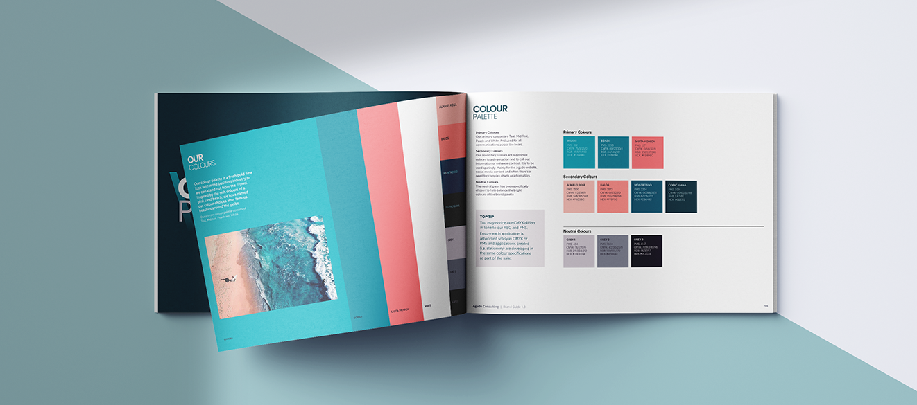
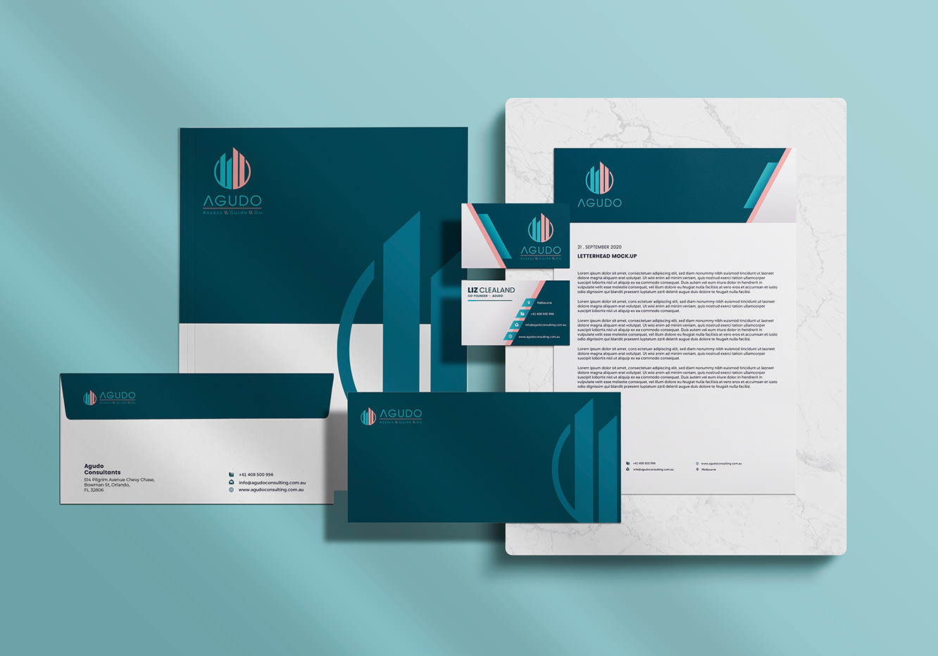
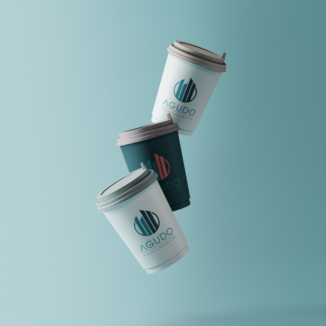
The next step was a new colour palette. With their hearts set on a slight makeover to their existing teal colourway, I presented them with a bunch of new user friendly choices. Ultimately, they went with a striking teal to pink palette that felt at home in their industry, but different enough to help them stand out - a classic balancing act.


Progress
This project has been completed in stages and is still ongoing.
How the work has progressed:
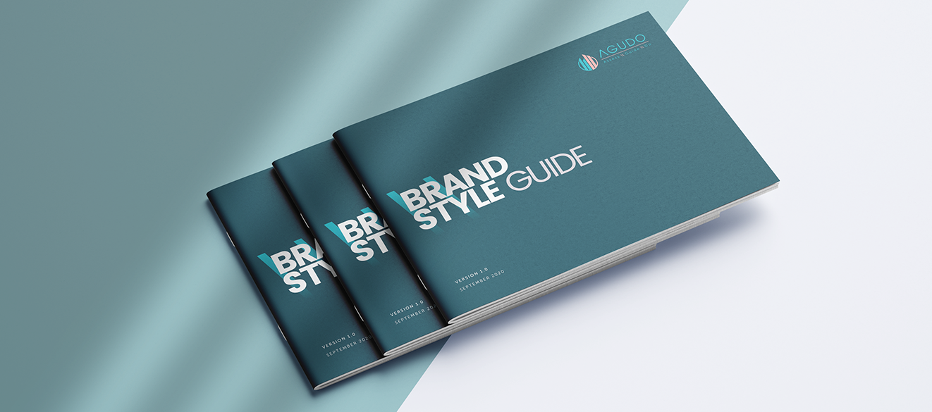
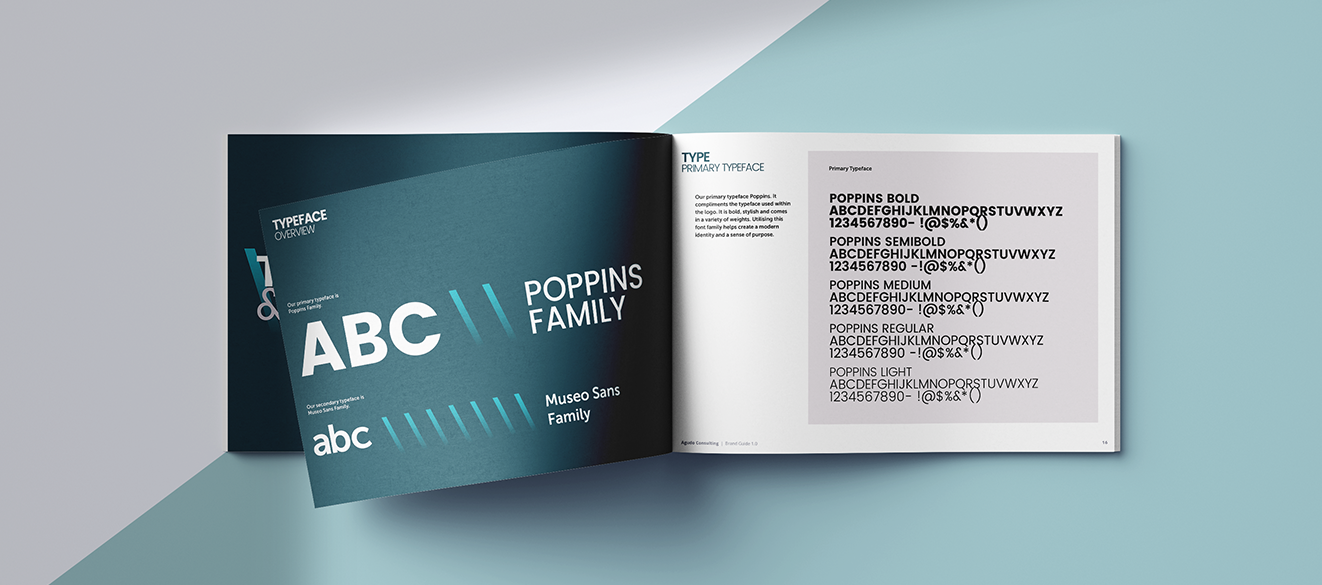
Stage 1: Corporate brand package with comprehensive style guide
Stage 2: Stationary collateral design and website design (web design via third party)
Stage 3: Digital and social media campaign
Stage 4: Presentations and marketing collateral