WHERE WE STARTED
The client was looking to get noticed by their desired target audience. Unsurprisingly, the printed word documents they were using as brochures weren’t quite cutting it anymore.
So, what did they need me to sort out for them?
● Enticing, high-end, glossy travel magazine
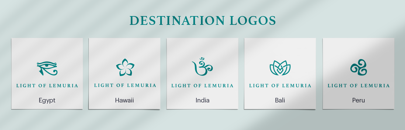
● Logo(s) with easily changeable icons for each travel destination
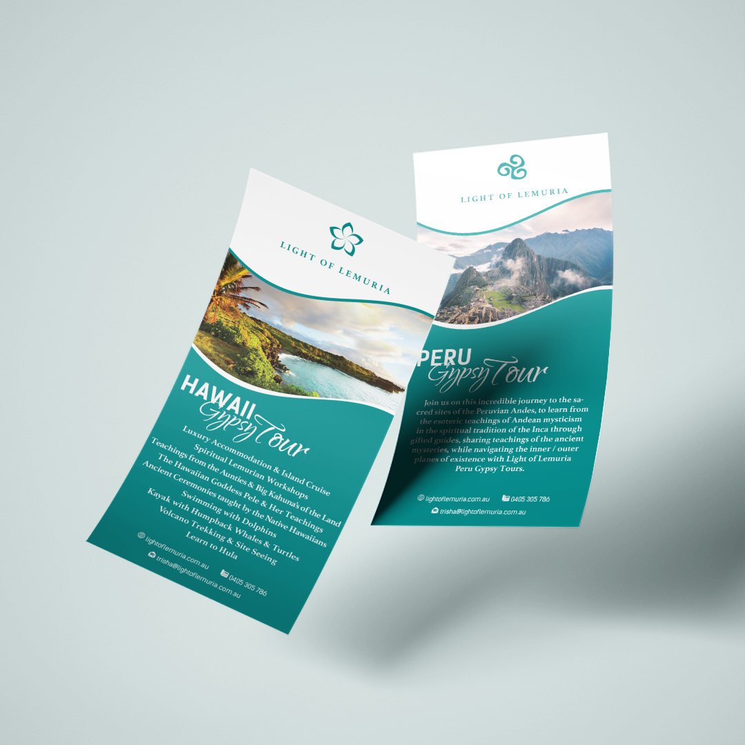
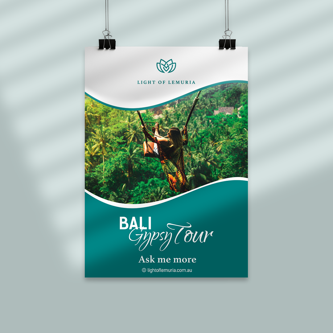
● Teal green as the primary colour
● Branding must include a wave shape
● Logo(s) with easily changeable icons for each travel destination
● Teal green as the primary colour
● Branding must include a wave shape

Where we wound up
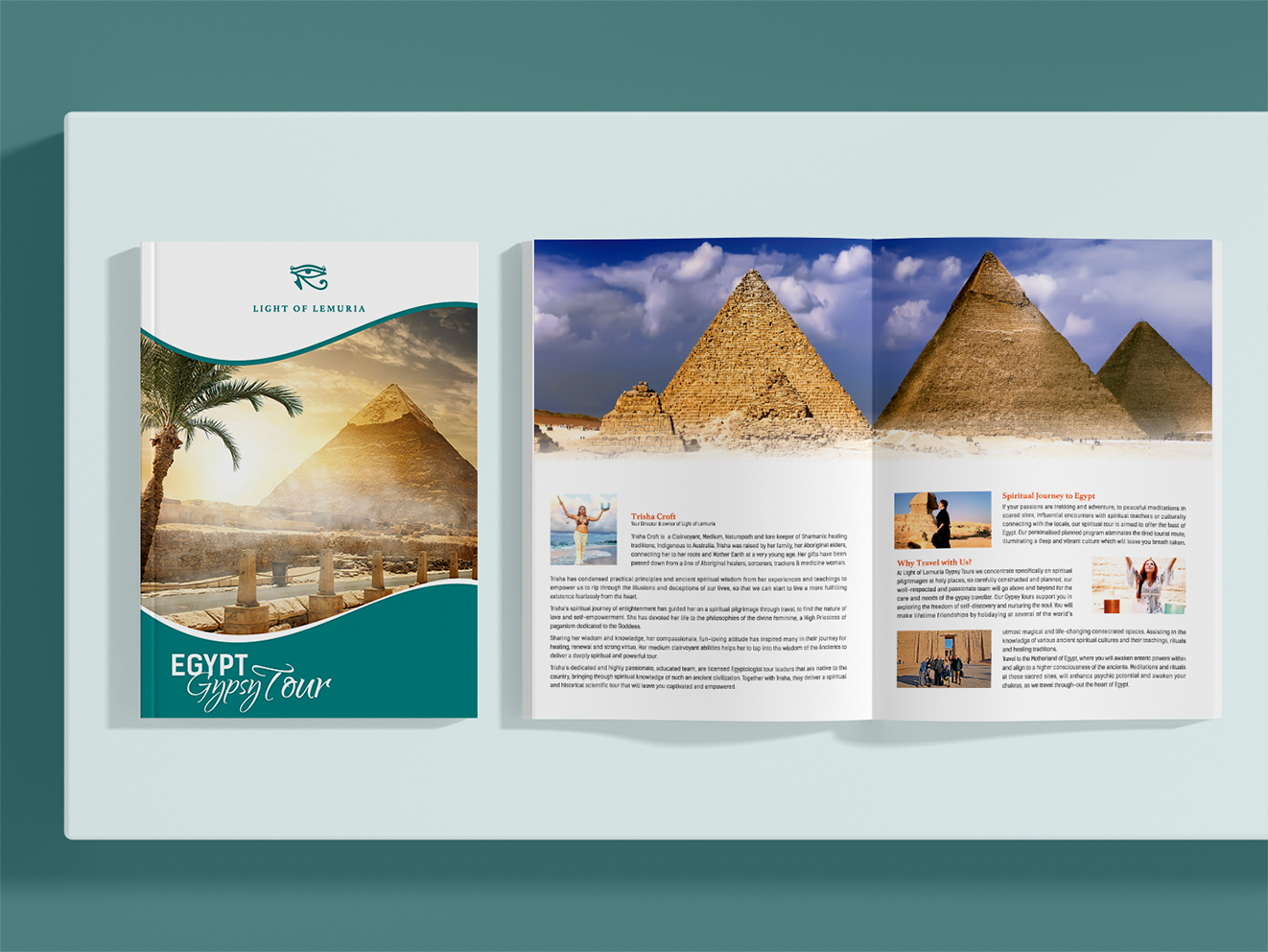
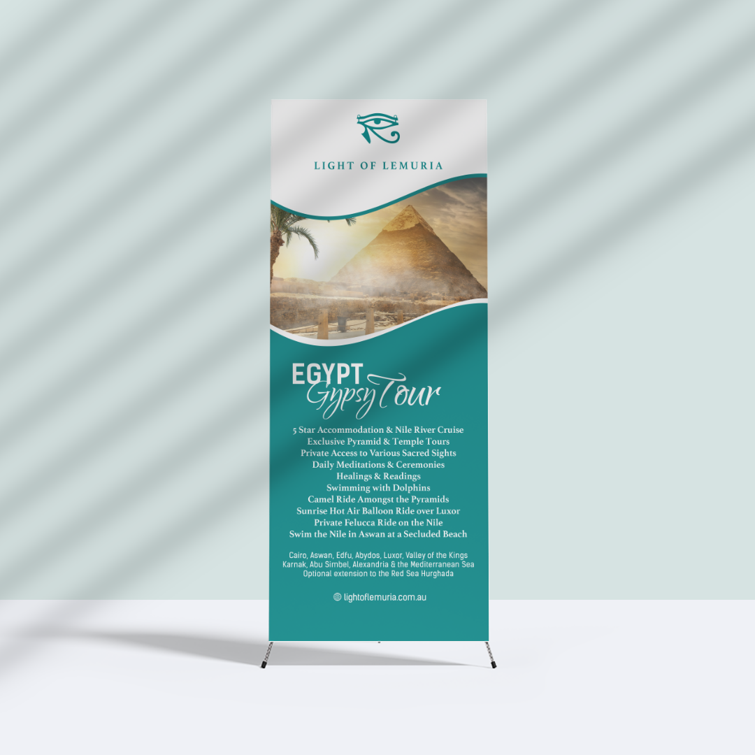
This project was completed in stages. The first stop: Egypt.
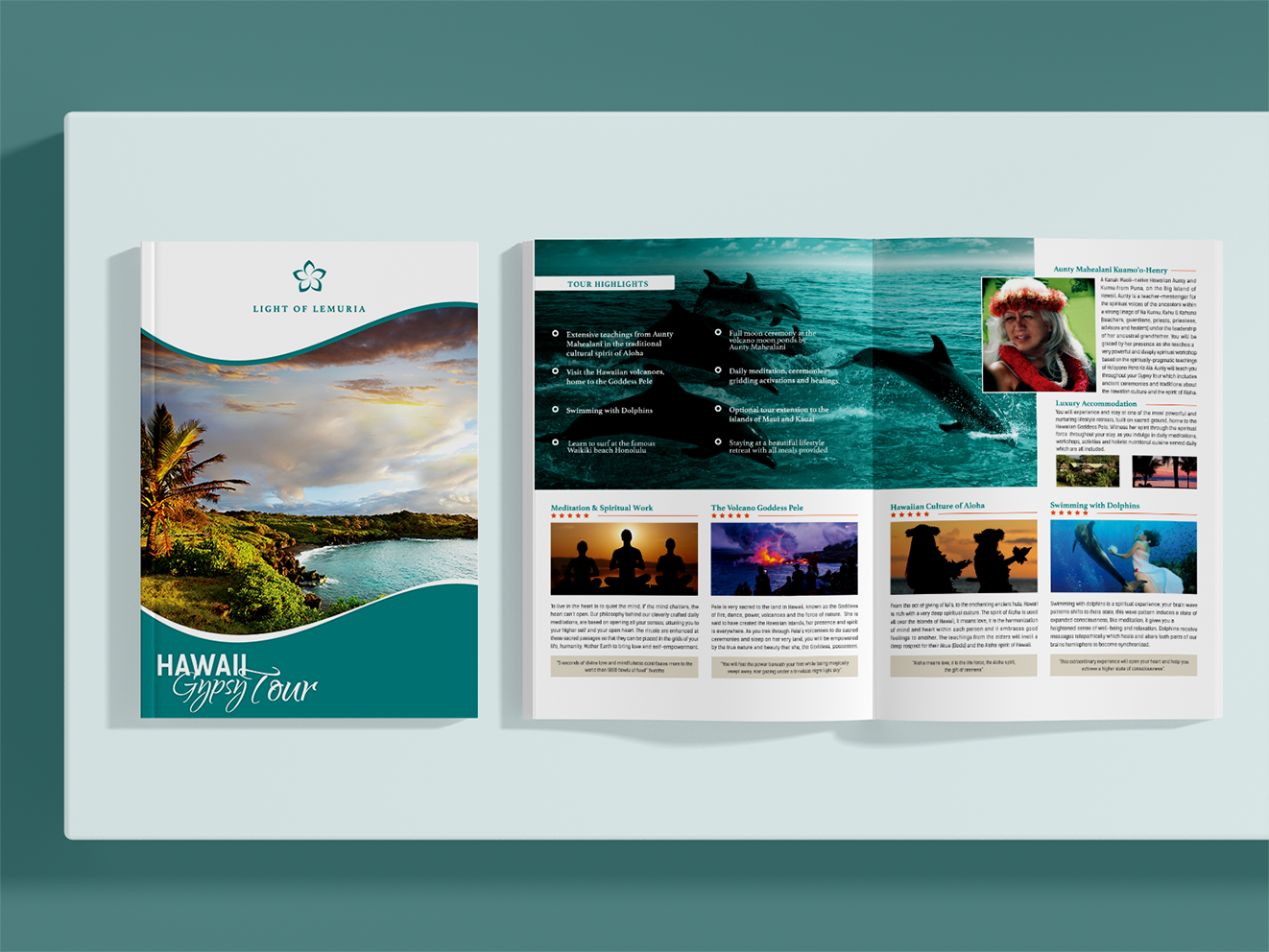
Using a combination of serif and sans serif typeface, a simple wave design, and a clean contrast of teal on white, the client now had a professional brand to attract new customers.
And for the Egyptian icon? The Eye of Horus.
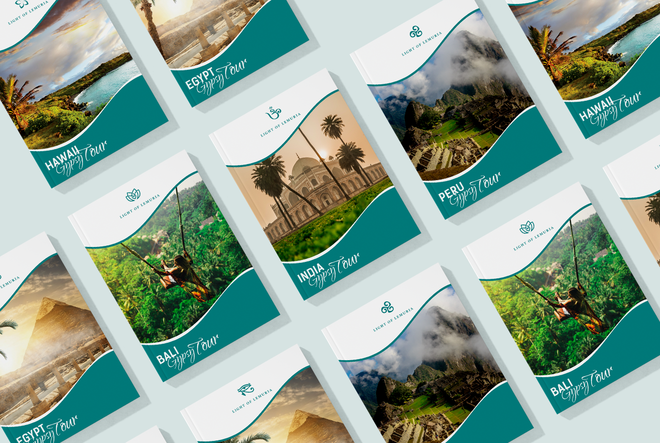
Getting away from the simple, self printed information packets worked a treat. After launching the new brand, the client booked three Egyptian tours for the following year in 6 months. This was a quick jump up compared to their previous schedule of one tour a year. Not long after, they were helping people jet set to several new destinations around the globe.
Final deliverables:
● 12 page magazines for each destination
● A logo(s) package
● Image discovery/selection/treatment
● Print marketing collateral
● Digital website banners
● Social media collateral