BIG. BOLD. BRIGHT.
It’s what I do best. And it’s what draws people to the lashes and nails and Adore Lash & Beauty.
I could keep it sleek and minimal. Mecca, Sephora, Inglot – I’m looking at you.
But where’s the fun in that?
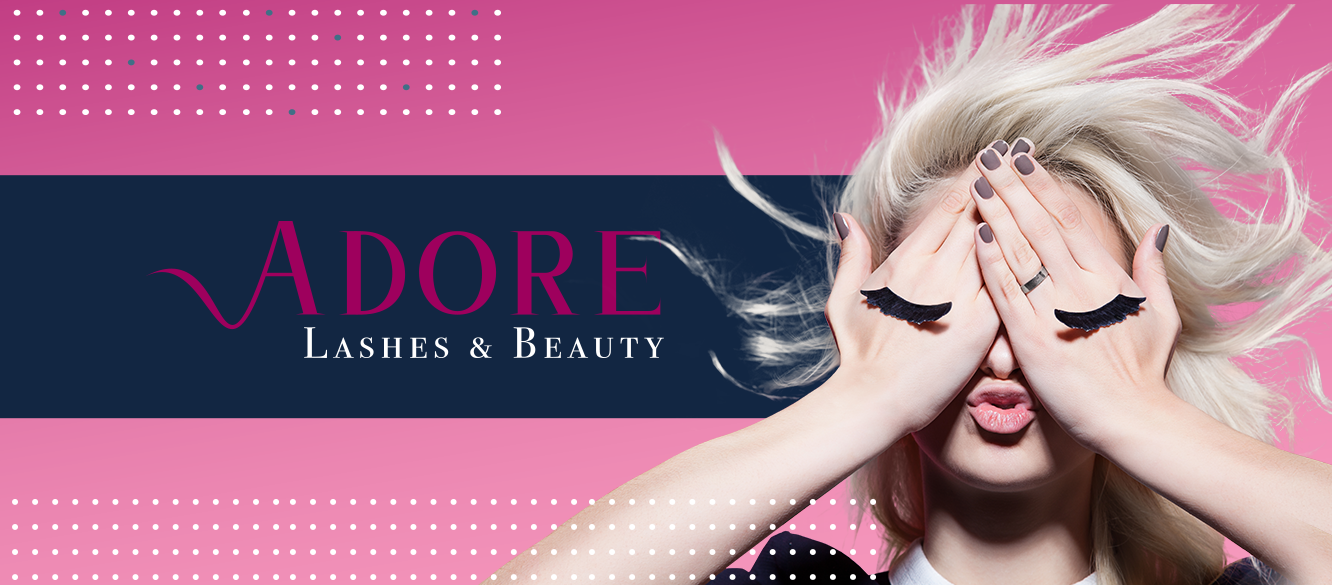
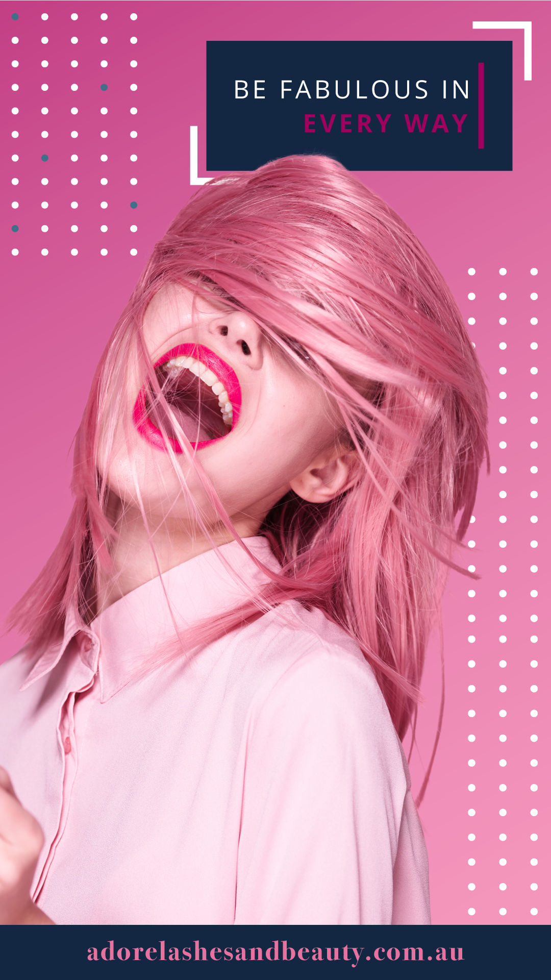
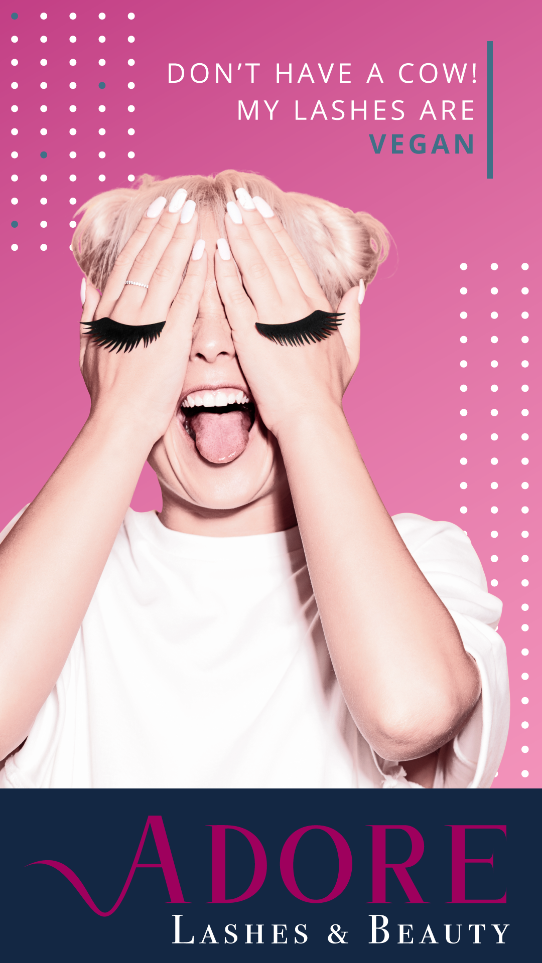
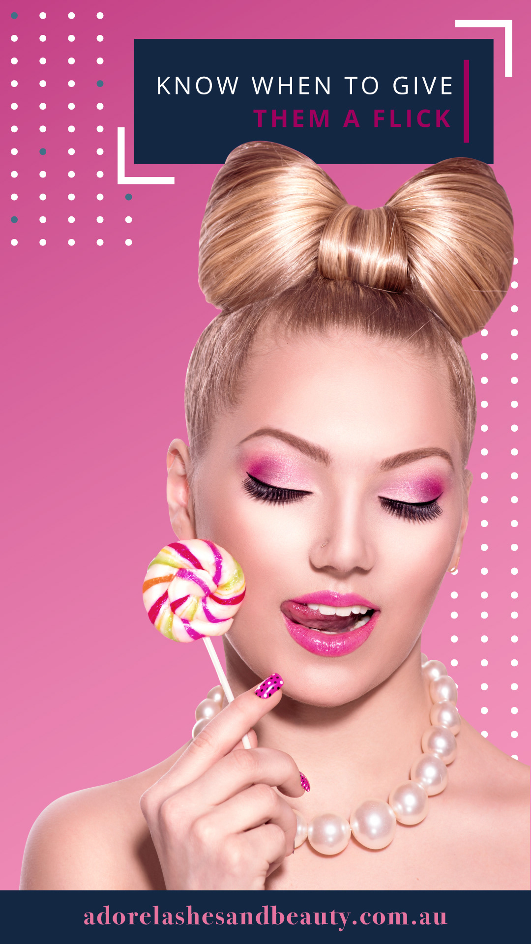
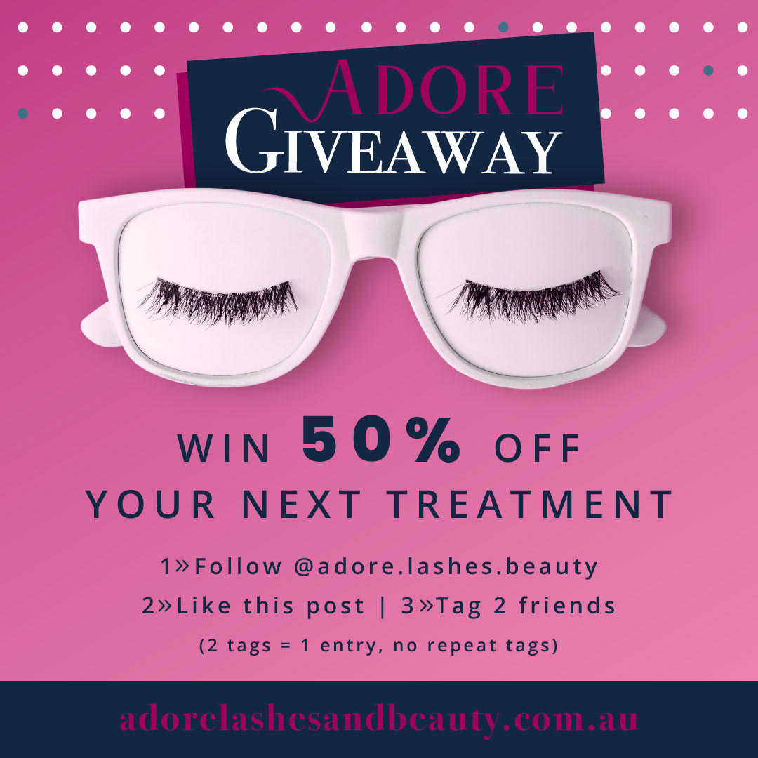
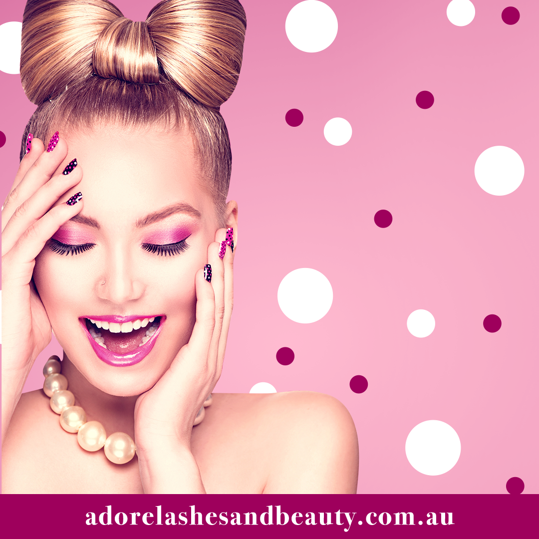
Pink. Vibrant. Hard to ignore.
These designs helped a beauty brand stand out.
WHERE WE STARTED
Wanting to change things up after the Covid crisis, the client felt it was time for a bright and bold new look.
The goal? Stand out from her competitors.
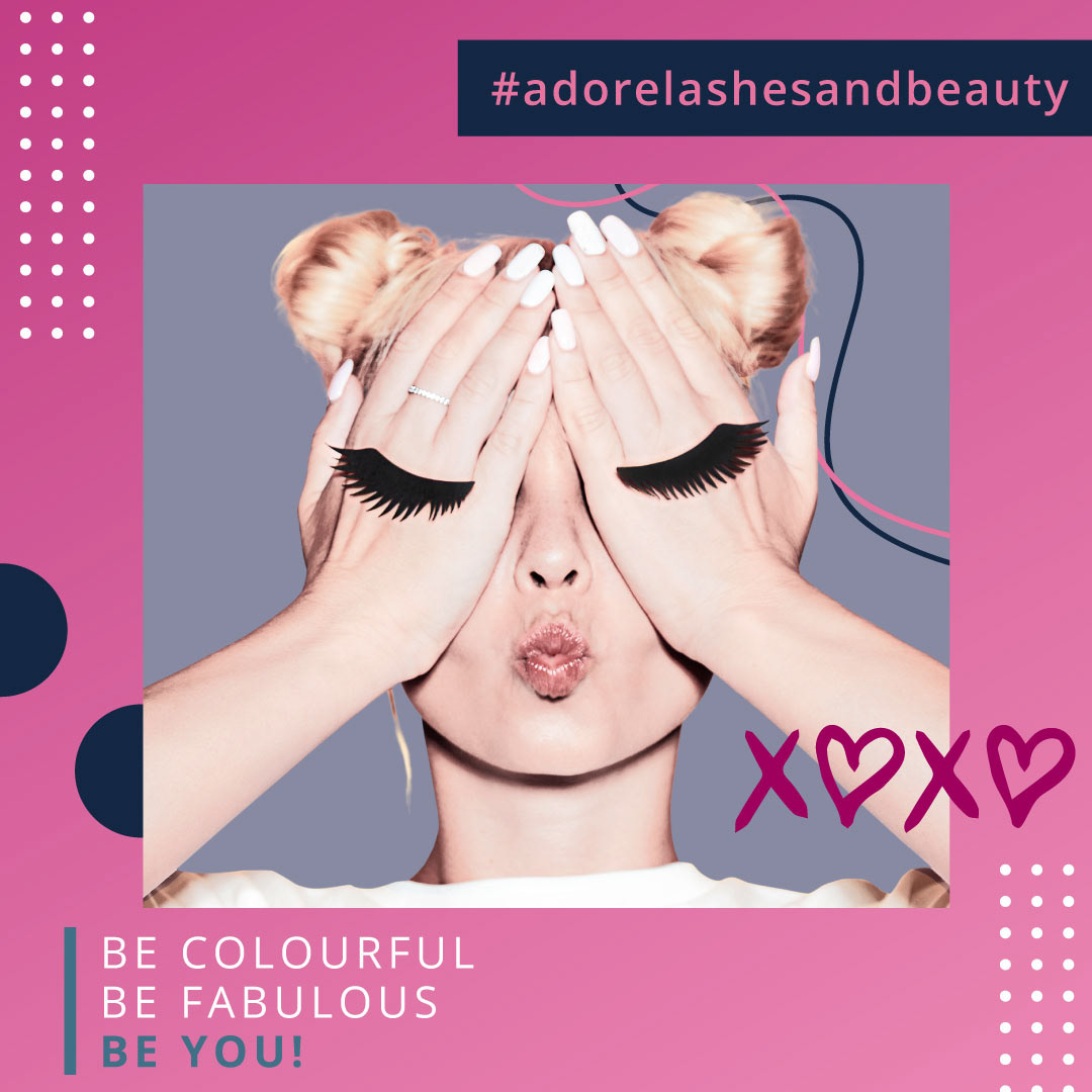
How? By keeping it fun, flirty and flash to attract a younger target audience. And all without looking like your run of the mill beauty salon graphic.
Where we wound up
There wasn’t any messing about here.
Contrasts were going to get the job done. A bright mulberry pink as the primary colour worked hand in hand with a classic serif font to avoid any generic beauty shop vibes.
And despite the possibility of diving into a design focused on images of eyes (we’re talking about lashes after all), I decided that to really get noticed, a little more subtlety was going to do the trick. A flowing ‘A’ in the brand logo had a hint of liquid eyeliner about it, and a deliberate, ‘no open eyes imagery’ approach left just enough for potential clients to get a feel for what the brand is all about.
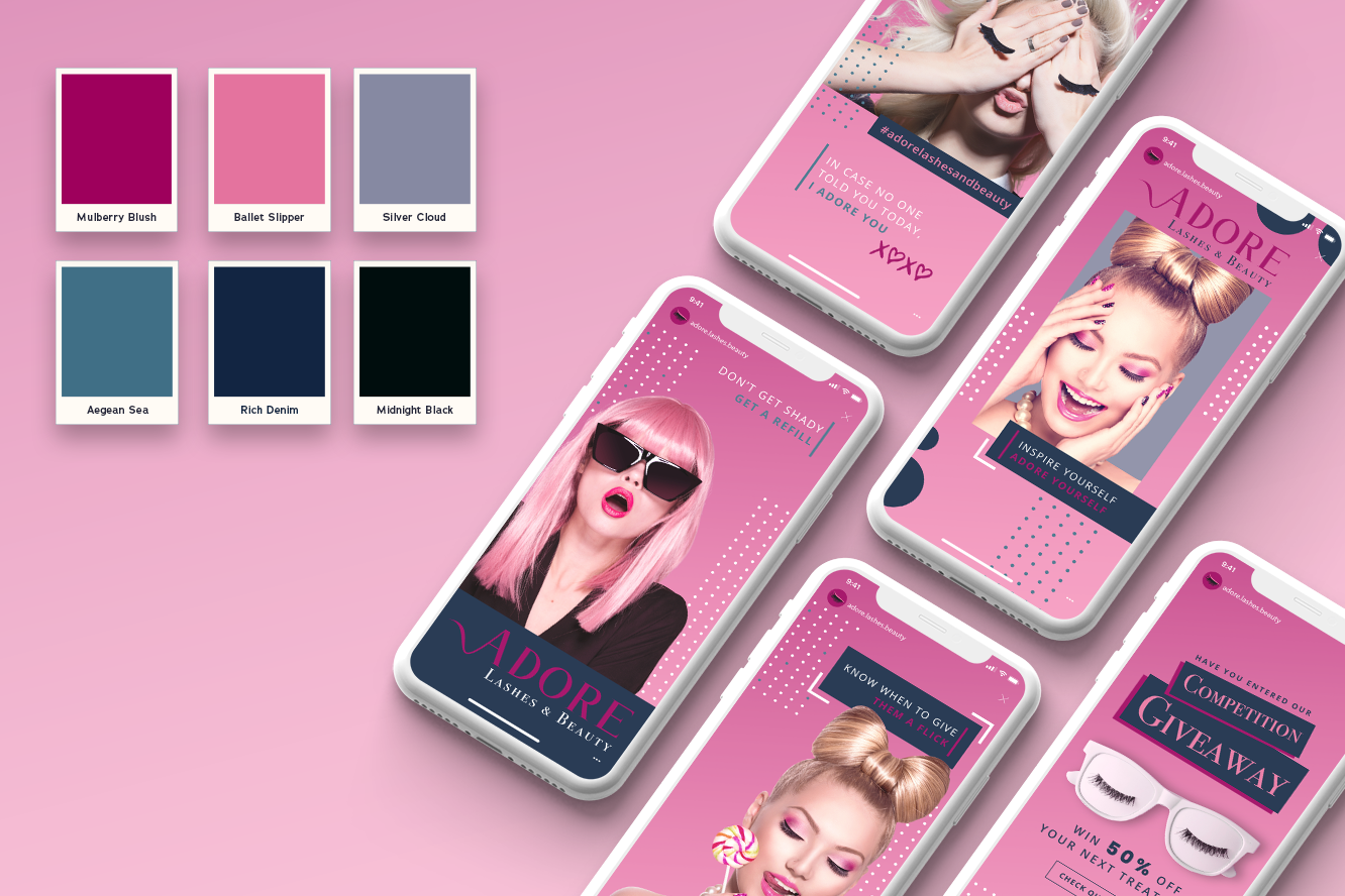

Final deliverables:
● Corporate logo package
● Style guide
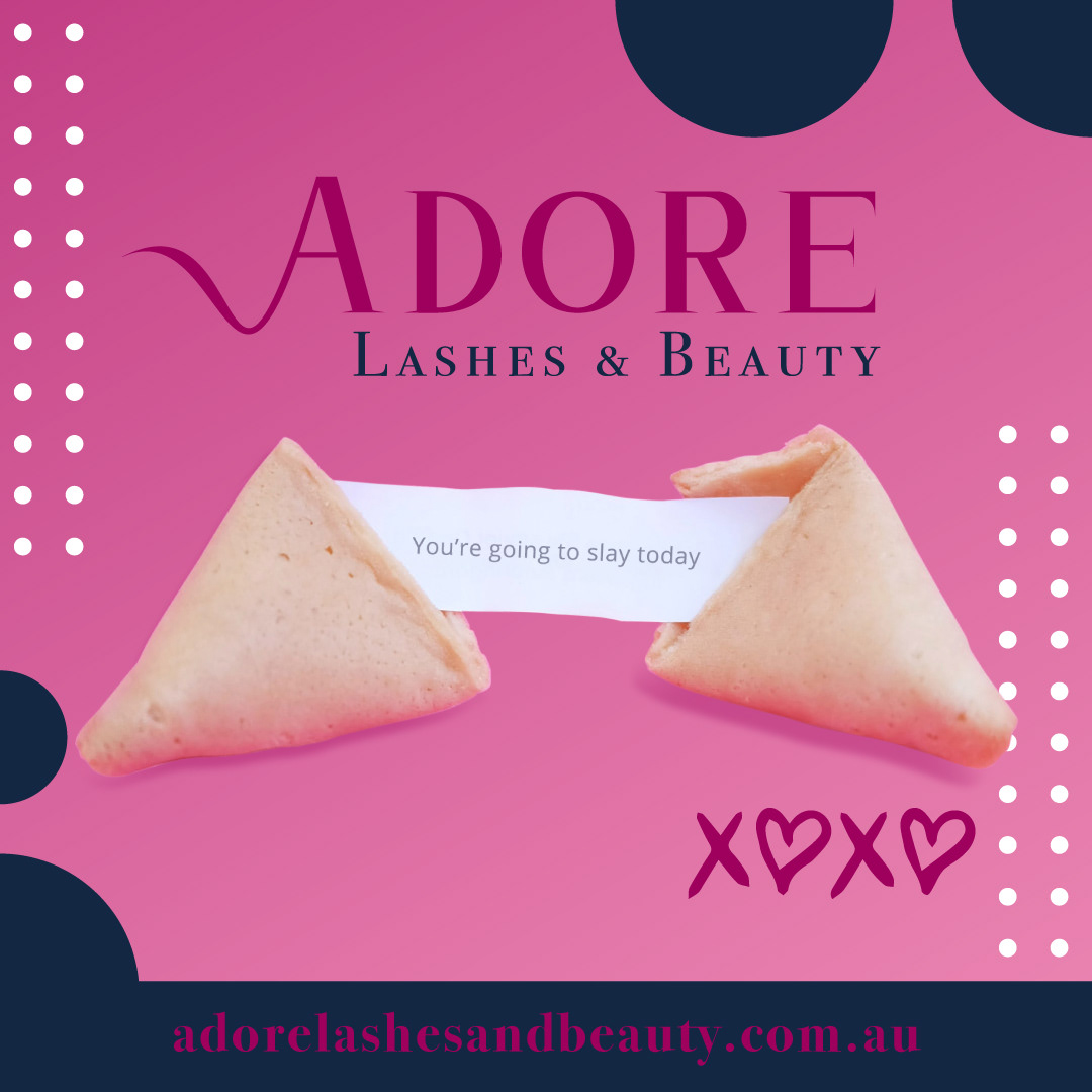
Social media content:
● Non-messaging posts
● Messaging with a positive point of view for the target audience
● Video posts