WHERE WE STARTED
Without the necessary print advertising and website, the client realised that getting on the festival circuit would be a tad tricky. He reached out for help in adding a sheen of professionalism with a new brand design.
The client’s vision: A brand that was a true representation of his personality

Where we wound up
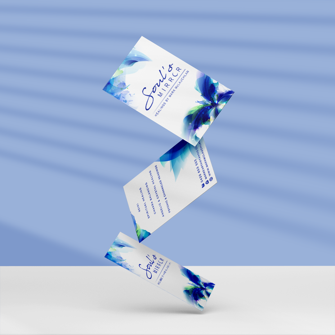
In this industry, blue and green colours represent growth, evolution and healing, while the butterfly represents transformation.
Set against a white background, the free flowing watercolour style art leaps out at potential customers, sharing the personality of the brand and the person behind it.
It was good vibes all round when the new brand was launched. The client soon found themselves booked for Australia’s largest spiritual festival – ‘Mind Body Spirit’.
And since then, they’ve been invited back to the festival four times, leading to a client base increase of 41%.
With such quick growth, Soul’s mirror has now expanded the business into online workshops and courses, which in turn, has led to a steady stream of new students.


Final deliverables:
● Business Logo package
● Series of print marketing assets
● Social page collateral
● Website banners
● Iconography
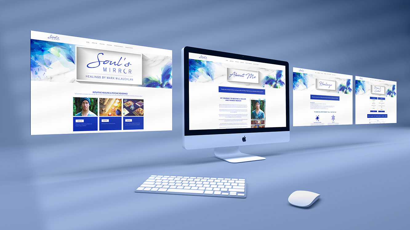
● Assistance with Wix website design
● Series of print marketing assets
● Social page collateral
● Website banners
● Iconography
● Assistance with Wix website design